So, what’s all this craze about the 2019 Pantone Color of the Year, Living Coral? Heck, what is a Pantone?
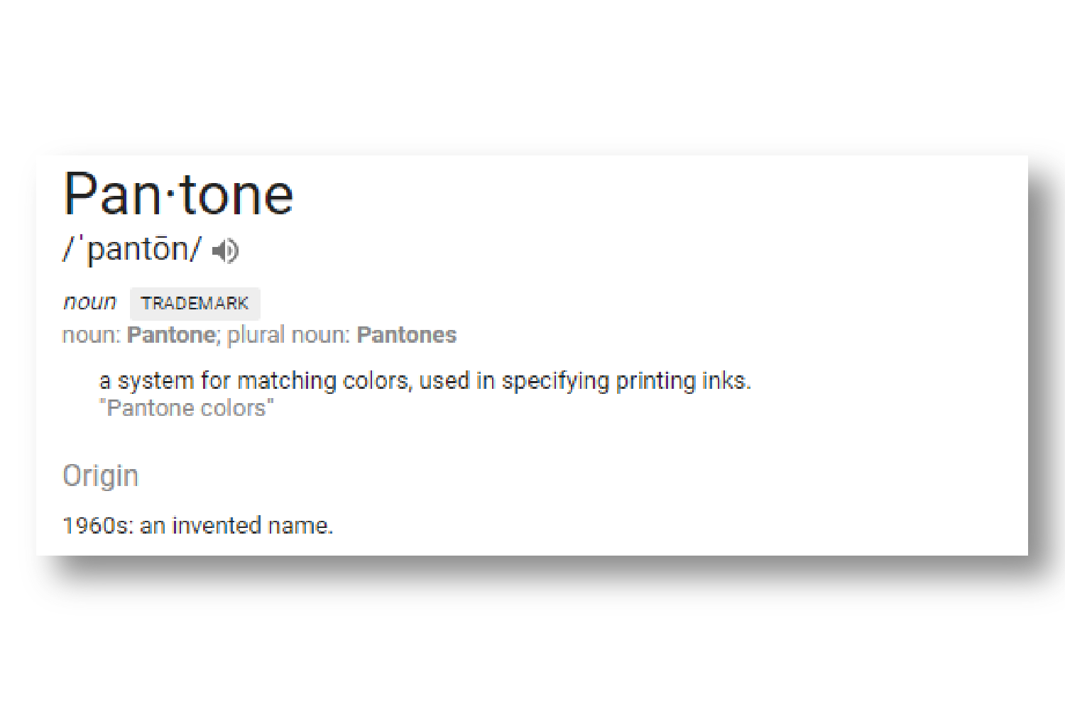
The Pantone Matching System (PMS) is known as the universal language of color, and is a proprietary color space that’s used in a variety of industries, primarily graphic design, fashion design, and product design; and enables critical color decisions in every stage of the workflow, from branding to manufacturing.
Now, back to the 2019 Pantone Color of the Year…Living Coral…
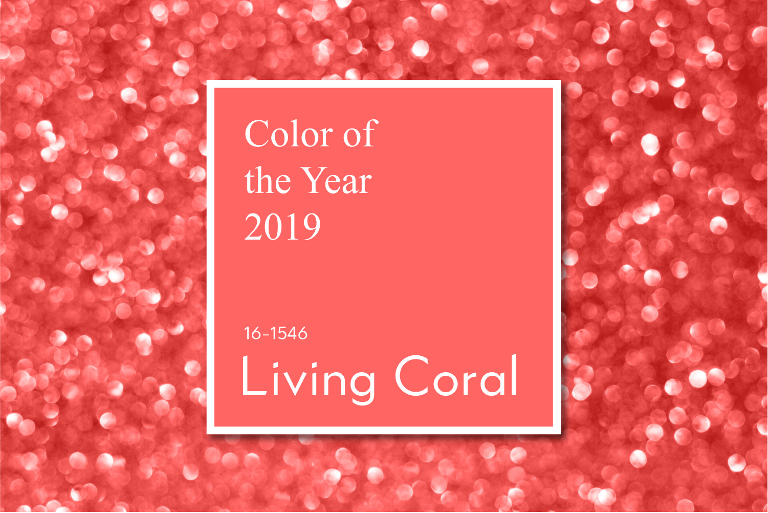
…it’s vibrant, but also mellow…it embraces warmth, and nourishment, and wellness…it encourages lightheartedness, and embodies playful expression. Living Coral represents the fusion of our modern lives that appear in our natural surroundings, and at the same time, shows a lively presence within social media. Its animating and life-affirming coral hue and golden undertone energizes and enlivens with a softer edge.
And just like that, the Pantone Institute highlights top seasonal colors for the runway, forecasts global color trends, and provides advice to companies on product colors and visual brand identity. More than likely, what you’re wearing, or that cup you’re sipping your favorite cup of joe from, or that pin and that planner you’re writing your 2019 goals in, or your next event’s color palette has been inspired in some kind of way by a previous or current Pantone Color of the Year. Take a look at how Living Coral has inspired the color trend in fashion, office spaces, home decor, and events.
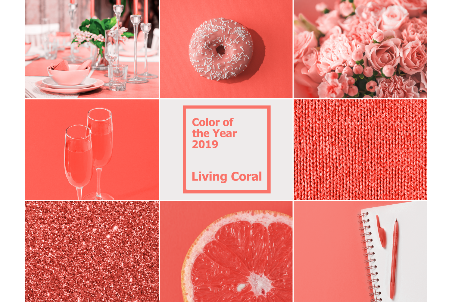

All images are courtesy of Google search.
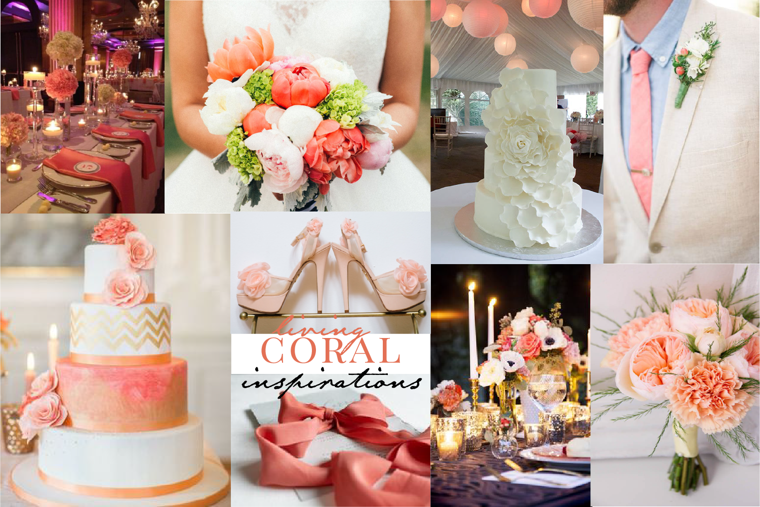
2019 Pantone Color of the Year inspired wedding looks. All images are courtesy of Google search.
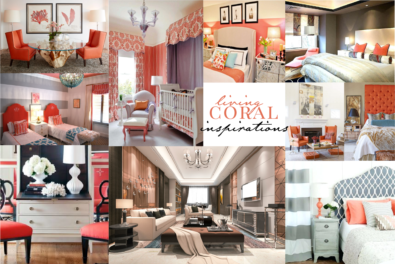
See how the 2019 Pantone Color of the Year inspired is making its way into home decor. All images are courtesy of Google search.
So, What’s Your Color for 2019?
It’s called color psychology…it works. Just looking at how this color inspired the looks across many different spaces invoked/sparked/made you have some or all of the feels described earlier, didn’t it? So, what’s your color for 2019? Is it Living Coral, or will it be something else? Are you still in love with 2018’s Ultra Violet, or 2017’s Greenery? PMC is here, helping set the tone, creating the vibe for your event and stationery designs. Living Coral will set a tone of vibrancy, and bring a modern appeal. What color speaks to you? What color will you choose to spark a certain feeling in a custom gift you want to give to that special someone, or in your new branding for your company that’s about to take off, or for a luxurious and vibrant birthday celebration you’re planning?
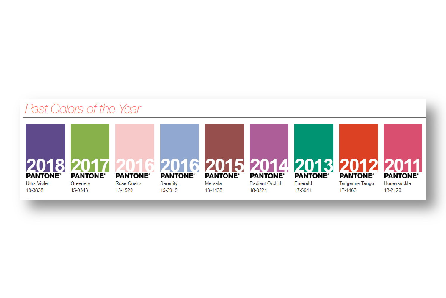
Check out years’ past Pantone Colors of the Year. There have been some amazing colors, and trended throughout many spaces. Yep, you saw them. You may not have known why you were seeing those colors everywhere, but the Pantone Institute takes the credit. I’ll be sharing some images from one of PMC Real Couple’s Coral and Champagne inspired wedding, and another PMC Real Couple’s LOVE for the 2016 Pantone Colors of the Year, Roze Quartz & Serenity Blue, a little later…so stay tune.
For ALL the latest from PMC, don’t forget to follow Paper&More Creations on Instagram and join our mailing list.
